


Experiments

Collapsing Header

A large title that hands over to a compact bar as the list scrolls, read straight from the scroll position

November 18, 2026

Experiments

  • Squircle

    The continuous-curve corner, from a single SVG filter

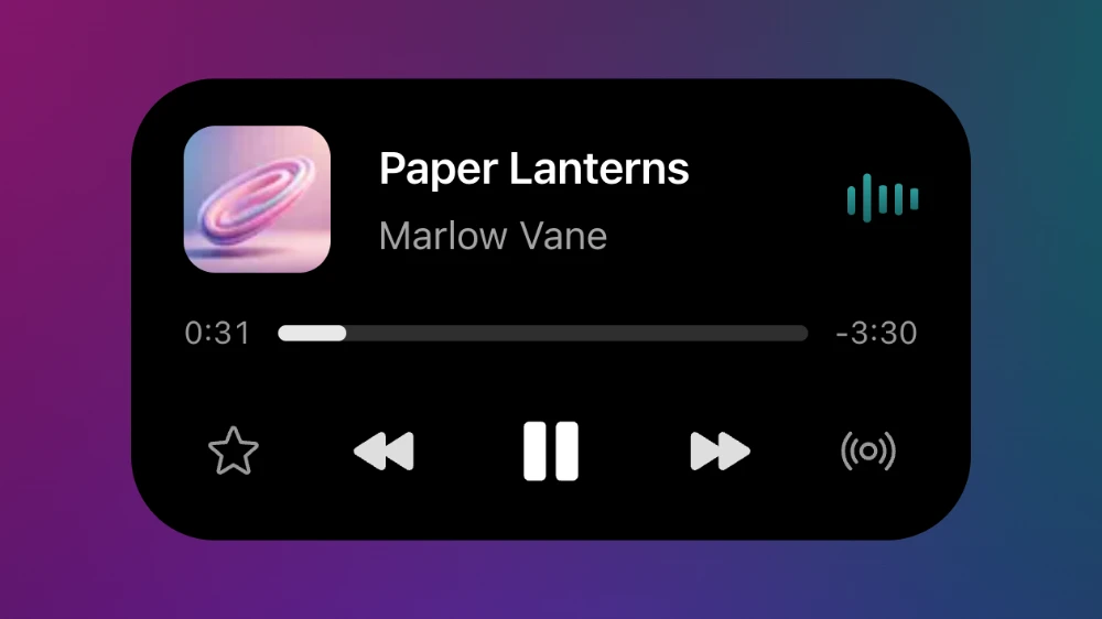
  • Dynamic Island

    The Dynamic Island and the morph between its states, rebuilt with Motion

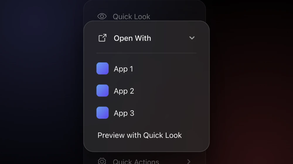
  • iOS Menu

    Recreating the iOS context menu submenu expansion with Motion

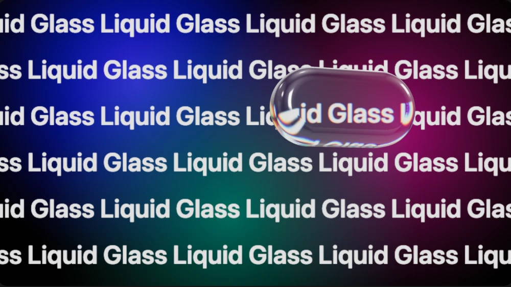
  • Liquid Glass

    Liquid Glass rebuilt as real refractive geometry with Three.js

  • Fluid Input

    A fluid search input with Motion

  • Letter Cascade

    A simple text reveal animation made entirely with CSS

Scroll the list

The large title from a navigation bar on iOS1: the big "Experiments" heading that shrinks into the bar as you scroll the list, and grows back when you scroll up. It isn't a header that switches state when you pass a threshold. There is no threshold, no class toggled and no transition. Every property is a function of how far the list has scrolled, so stopping halfway leaves it halfway, and scrolling back plays it in reverse.

I wanted to try Motion's useScroll hook, and I had been watching how my phone does this large title animation. I thought it was really cool. I built it together with an AI agent, and explained in words how it should work. The full code is at the end.

What went wrong first

The one number that had to be right was the overlap. I found this problem and explained it to the agent. If the large title finishes fading exactly where the compact one starts, there is a scroll position where neither is legible, and the bar reads as empty. Starting the compact title at 60% while the large one runs to 70% gives a short stretch where both are faint. That is the part that makes it read as one title moving up, rather than two titles swapping.

How it works

Motion's useScroll2 gives the list's scrollY as a motion value, and useTransform3 maps it onto everything else over the first 56px. The large title fades out over the first 70% of that distance and shrinks to 0.92, scaled from its bottom-left corner so it sinks into place rather than drifting toward the middle. The bar behind it goes from clear to a 16px blur with the saturation up at 180%, under a fill that reaches 75% opacity. Its hairline and the compact title arrive over the last 40%, and the compact title rises 6px as it fades in. I tuned the blur and the overlap by eye.

Pulling the list down past the top stretches the title up to 1.08, the way the rubber band does on iOS. Whether you see that depends on the browser reporting a negative scroll position while it overscrolls, and Chrome doesn't. It stops the list at 0, and the title stays put. The collapse itself works well in Chrome.

If you're about to build one

The compact title is hidden from screen readers, since it repeats the heading that is already in the list, so there is one heading to land on rather than two. If you prefer reduced motion, the titles only crossfade: nothing scales, stretches or slides, and the bar still blurs in, since that changes what you see rather than moving it.

I would use this to tune up mobile views.

The code

CollapsingHeader.tsx

"use client"
import { motion, useReducedMotion, useScroll, useTransform } from "motion/react"
import Image from "next/image"
import { useRef } from "react"
import { useCollapsingHeaderTuning } from "./tuning"
// the site's own published experiments, so the list carries real titles, copy and pictures
const ITEMS = [
{
slug: "squircle",
title: "Squircle",
body: "The continuous-curve corner, from a single SVG filter",
},
{
slug: "dynamic-island",
title: "Dynamic Island",
body: "The Dynamic Island and the morph between its states, rebuilt with Motion",
},
{
slug: "ios-menu",
title: "iOS Menu",
body: "Recreating the iOS context menu submenu expansion with Motion",
},
{
slug: "liquid-glass",
title: "Liquid Glass",
body: "Liquid Glass rebuilt as real refractive geometry with Three.js",
},
{ slug: "fluid-input", title: "Fluid Input", body: "A fluid search input with Motion" },
{
slug: "letter-cascade",
title: "Letter Cascade",
body: "A simple text reveal animation made entirely with CSS",
},
]
/**
* A large title that collapses into the navigation bar as the list scrolls. Nothing here is a
* transition: the title's opacity and scale, the bar's blur and hairline, and the compact title are
* all read from the scroll position, so they track the finger exactly and reverse with it.
*/
export function CollapsingHeader() {
const { collapse } = useCollapsingHeaderTuning()
const reduced = useReducedMotion()
const container = useRef<HTMLDivElement>(null)
const { scrollY } = useScroll({ container })
// pulling past the top stretches the title, the way the rubber band does on iOS. With reduced
// motion the titles only crossfade, and nothing grows, shrinks or slides
const titleScale = useTransform(
scrollY,
[-80, 0, collapse],
reduced ? [1, 1, 1] : [1.08, 1, 0.92],
)
const titleOpacity = useTransform(scrollY, [0, collapse * 0.7], [1, 0])
const barBlur = useTransform(
scrollY,
[0, collapse],
["blur(0px) saturate(100%)", "blur(16px) saturate(180%)"],
)
const barFill = useTransform(scrollY, [0, collapse], [0, 0.75])
const hairline = useTransform(scrollY, [collapse * 0.6, collapse], [0, 1])
const compactOpacity = useTransform(scrollY, [collapse * 0.6, collapse], [0, 1])
const compactY = useTransform(scrollY, [collapse * 0.6, collapse], reduced ? [0, 0] : [6, 0])
return (
<>
<div
className={
"corner-squircle relative h-[480px] w-full max-w-[360px] overflow-hidden rounded-[36px] bg-neutral-100 text-neutral-900 shadow-card dark:bg-neutral-900 dark:text-white"
}
>
<motion.div
style={{ backdropFilter: barBlur, WebkitBackdropFilter: barBlur }}
className={"absolute inset-x-0 top-0 z-10 flex h-12 items-center justify-center"}
>
<motion.span
aria-hidden={"true"}
style={{ opacity: barFill }}
className={"absolute inset-0 bg-neutral-100 dark:bg-neutral-900"}
/>
<motion.span
aria-hidden={"true"}
style={{ opacity: hairline }}
className={"absolute inset-x-0 bottom-0 h-px bg-border"}
/>
<motion.span
aria-hidden={"true"}
style={{ opacity: compactOpacity, y: compactY }}
className={"relative font-semibold text-[15px]"}
>
Experiments
</motion.span>
</motion.div>
<div
ref={container}
className={"h-full overflow-y-auto overscroll-contain px-5 pt-12 pb-6"}
>
<motion.h3
style={{ scale: titleScale, opacity: titleOpacity, originX: 0, originY: 1 }}
className={"pt-2 pb-3 font-bold text-[30px] tracking-tight"}
>
Experiments
</motion.h3>
<ul className={"flex flex-col"}>
{ITEMS.map((item) => (
<li
key={item.slug}
className={"flex items-center gap-3 border-border border-b py-3 last:border-b-0"}
>
<div
className={
"relative aspect-video w-24 shrink-0 overflow-hidden rounded-lg bg-neutral-200 dark:bg-neutral-800"
}
>
<Image
src={`/experiments/${item.slug}/image.webp`}
alt={""}
fill
sizes={"96px"}
className={"object-cover"}
/>
</div>
<div className={"min-w-0"}>
<p className={"font-medium text-[15px]"}>{item.title}</p>
<p className={"line-clamp-2 text-[13px] text-text-secondary"}>{item.body}</p>
</div>
</li>
))}
</ul>
</div>
</div>
</>
)
}

tuning.ts

"use client"
import { createContext, useContext } from "react"
/**
* The numbers the header runs on. The published component reads these defaults; `/lab` is the only
* caller that replaces them, with DialKit.
*/
export interface CollapsingHeaderTuning {
/** the scroll distance, in px, over which the large title hands over to the bar */
collapse: number
}
export const COLLAPSING_HEADER_TUNING: CollapsingHeaderTuning = {
collapse: 56,
}
const CollapsingHeaderTuningContext = createContext(COLLAPSING_HEADER_TUNING)
export const CollapsingHeaderTuningProvider = CollapsingHeaderTuningContext.Provider
export function useCollapsingHeaderTuning() {
return useContext(CollapsingHeaderTuningContext)
}

References

  1. 1.Navigation bars · Human Interface Guidelines · Apple
  2. 2.useScroll · Motion
  3. 3.useTransform · Motion

Would you like to see more of this?

One email each time a new experiment is published.

Next experiment

Feature Tour

A pill that springs open into a card while the rest of the list makes room